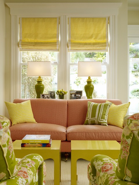
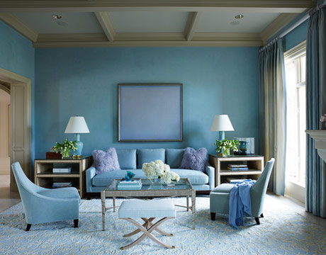
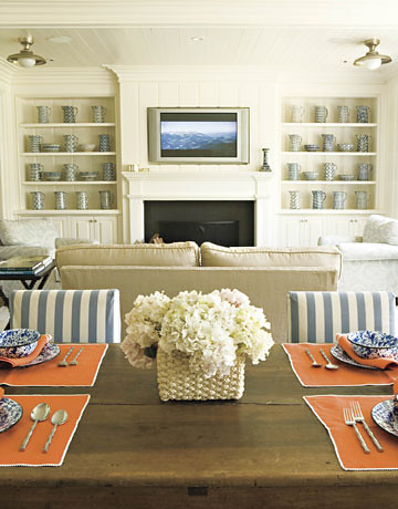
I've gone away to the blue shoreline. We're at the beach setting up the long awaited (and highly anticipated) beach house! I'll be back next week with pics!
Monday, February 28, 2011
Friday, February 25, 2011
Wednesday, February 23, 2011
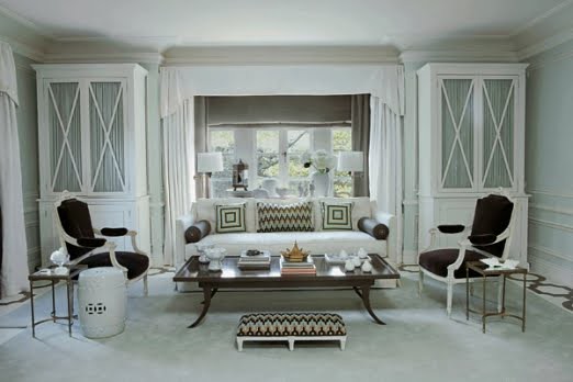
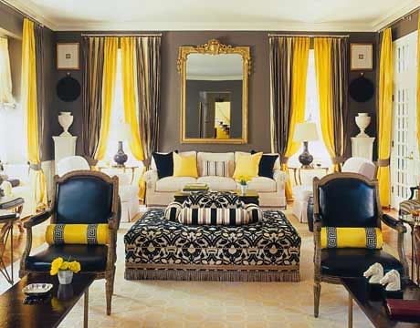
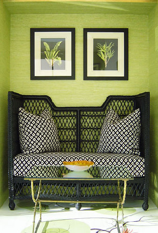
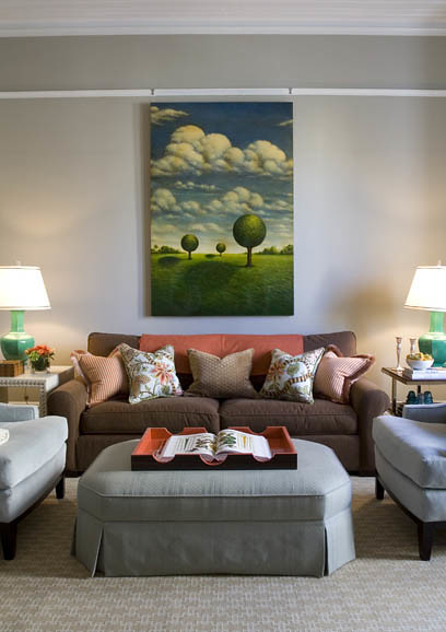
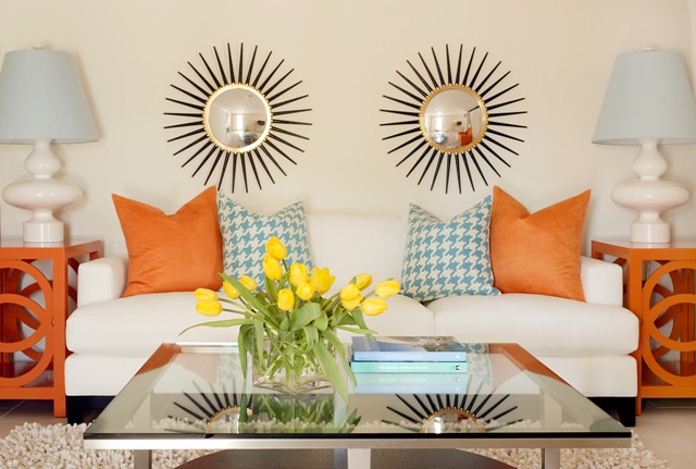
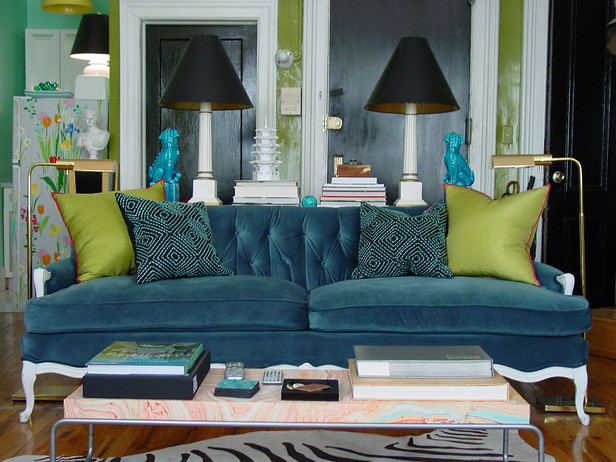
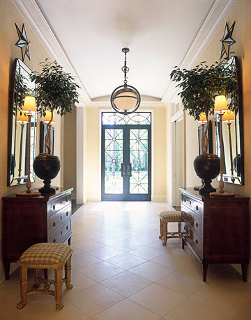
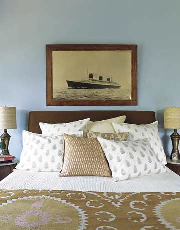
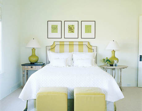
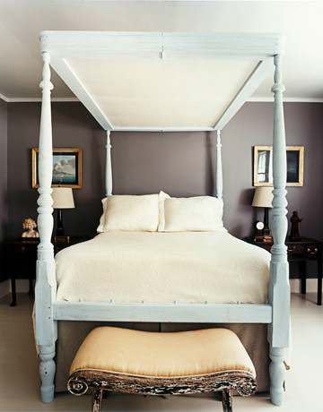
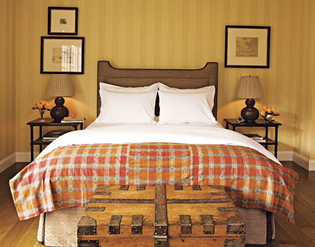
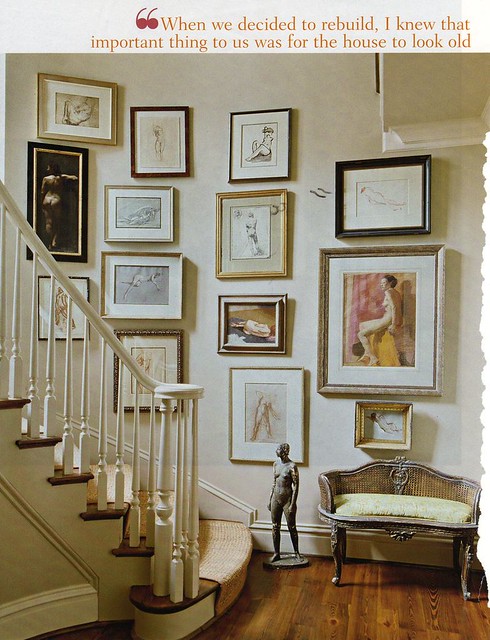
Symmetry and Balance
"The desire for symmetry, for balance, for rhythm is one of the most inveterate of human instincts." - Edith Wharton and Ogden Codman, Jr, The Decoration of Houses (here)
Symmetry -.
1. the correspondence in size, form, and arrangement of parts on opposite sides of a plane, line, or point
2.the proper or due proportion of the parts of a body or whole to one another with regard to size and form; excellence of proportion
3. beauty based on or characterized by such excellence of proportion
Balance - composition or placement of elements of design, as figures, forms, or colors, in such a manner as to produce an aesthetically pleasing or harmoniously integrated whole
Tuesday, February 22, 2011
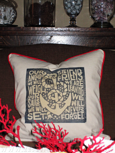
Sailor's Song Pillow
Aside from going out to supper with Josh, I spent all of today at home stressing over what I am going to pack for the beach (shorts?)...
wondering if my house is orderly enough to leave (it's not)....
and making this (!)...
Monday, February 21, 2011
Painter's Drop Cloth Pillows
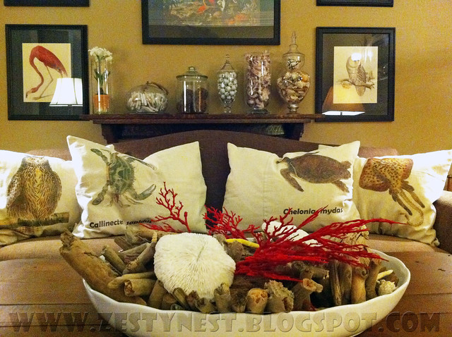
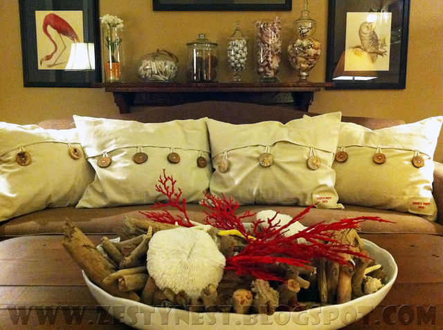
I spent the better part of this afternoon finishing up the throw pillows for the beach house. But I'm finally done! I made these to fit a standard size bed pillow (good for taking a nap on the sofa!). I chose images I liked from vintage printable (in this case, they all related to the area where the house is), printed them on iron-on transfer paper, and...well...ironed-on.
I got these FABULOUS buttons from A Remark You Made on etsy.
Seriously, they are awesome. Made from fallen tree branches, they are ultra chunky and full of character. And, of course, the fabric is painter's drop cloth picked up from Lowe's.
Saturday, February 19, 2011
Friday, February 18, 2011
Thursday, February 17, 2011
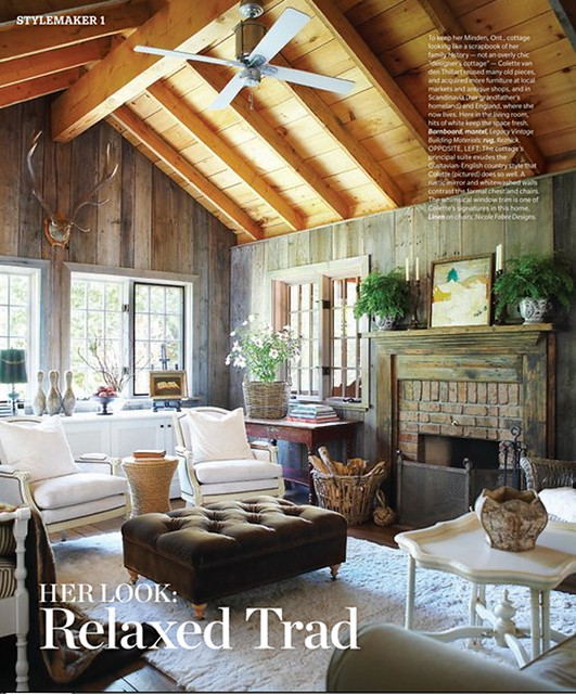
Relaxed, Rustic, and Totally Chic
I love the mix of light and dark, living and.....unliving, even the mix of woods (which would usually drive me a little crazy). I think all the windows and the white chairs, rug, buffet, and side table really punch up the room and keep it totally chic.
Tuesday, February 15, 2011
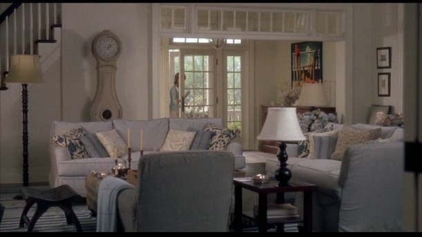
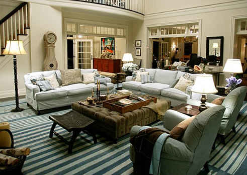
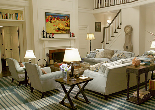
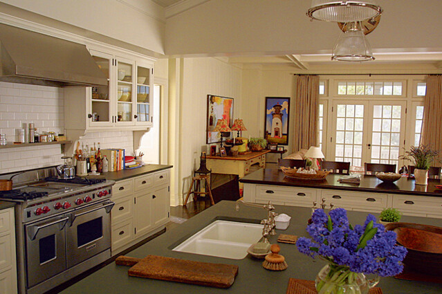
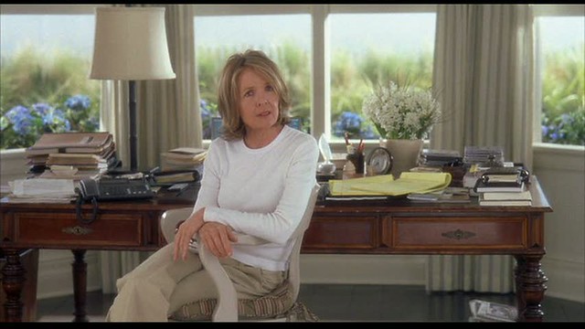
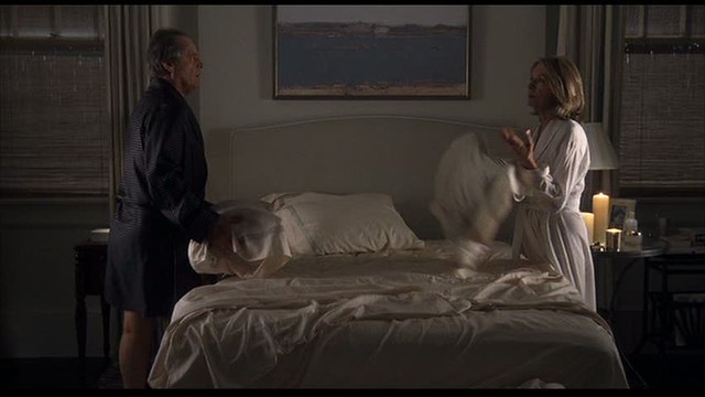
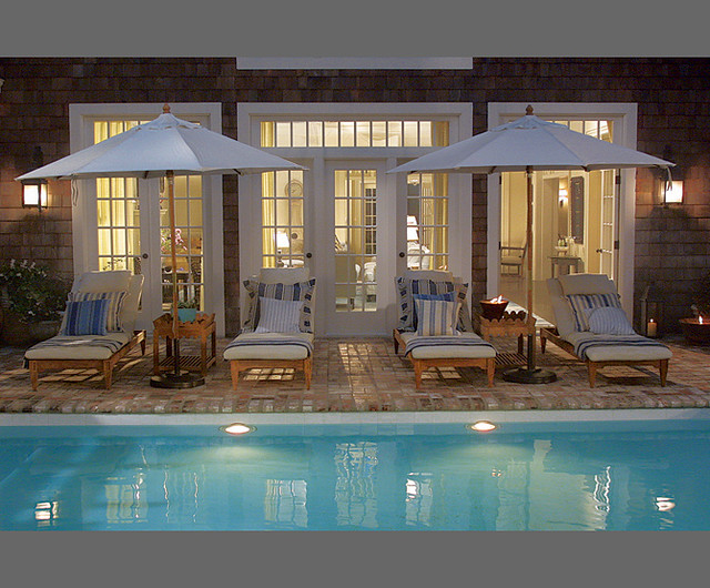
Something's Gotta Give Set Design
At the recommendation of my art buddies, I picked up a copy of Something's Gotta Give at Hastings a few days ago.
Last night being Valentine's Day, Josh agreed to watch it with me.
Or rather, he rolled his eyes while I cooed over the beautiful set.
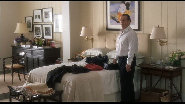
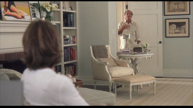
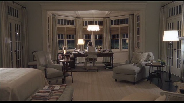
He kept guessing at the plot outcome (fairly predictable), and I kept saying,"But look at the house....It's wonderful. I would love to go there."
I thought the kitchen looked a little big, but when I saw the characters move around in it, it just seemed perfect.
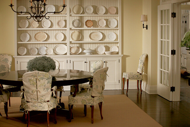
And the dining room looks exactly like something I would do.
The artwork is pretty remarkable too. I did a little digging and found out most of it was done by Kenton Nelson. I love his clean, fresh take on the everyday.
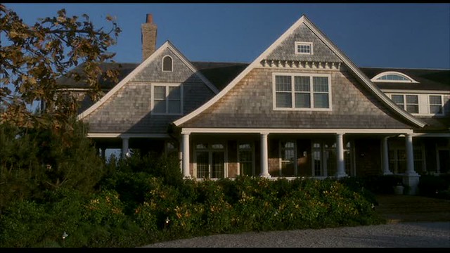
The movie takes place in the Hamptons, but the style of this house is so classic, it could go anywhere.
I found all the images over at Hooked On Houses. I love that she is able to find all these movie houses!
Subscribe to:
Comments (Atom)

